

ARIHAR
Logo &
Identity Design
Logo Design
Logo Design
Design Brief
Harihar is a upcoming real-estate company with a clientele which looks for quite luxury. The design goals for this project were:
We wanted to incorporate the real-estate aspect with one time recognizability. The logo should also be scalable and not too intricate as real-estate logos are put up on top of buildings.
High-end appearance
Upscale finish
Minimal aesthetic
Conveys exclusivity
Scalability
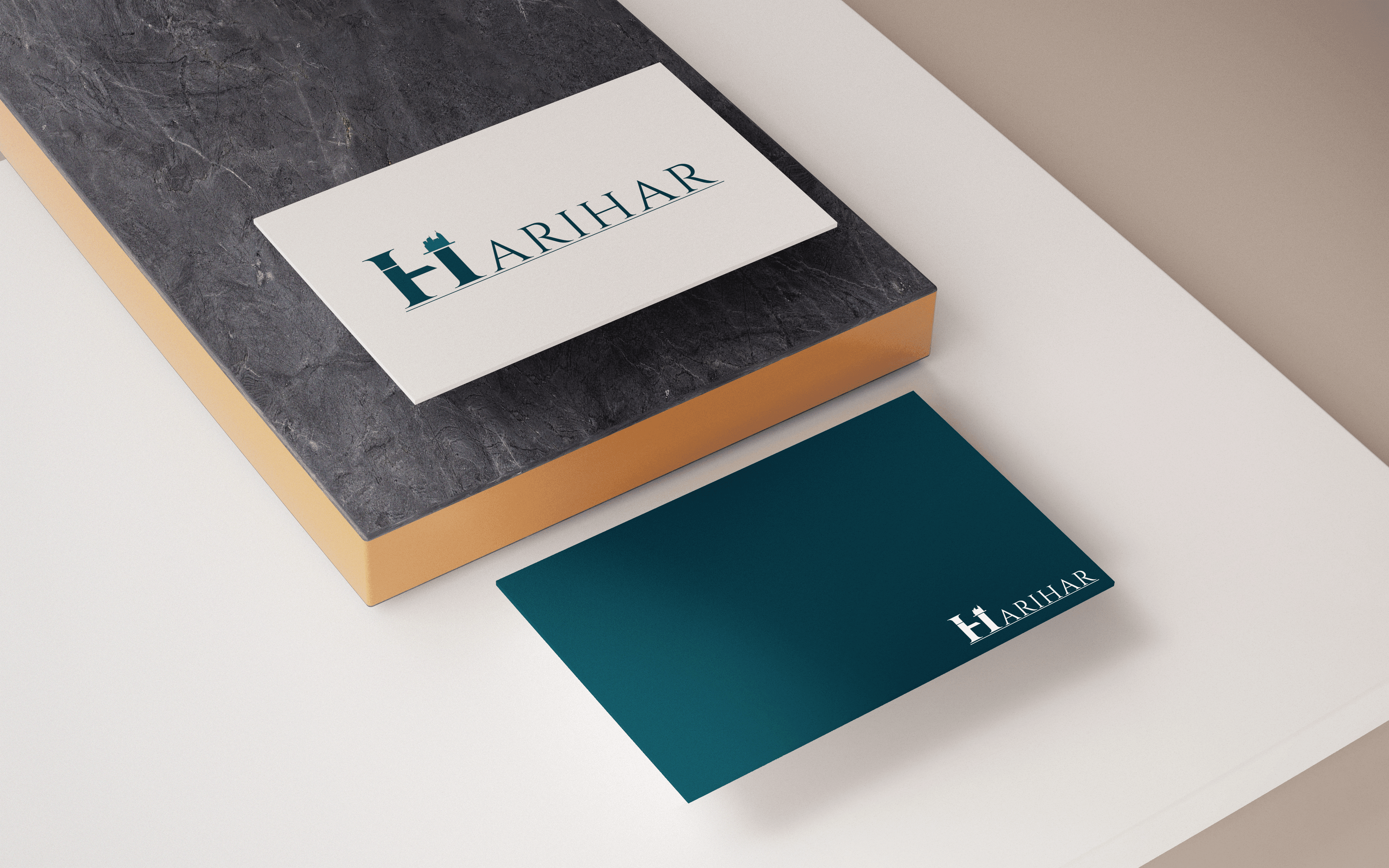
Final Logo
About
Primary Logo
Secondary Logo
Primary Logo With Tagline
Secondary Logo With Tagline
ARIHAR
Font choice
Logo Motif
Logo Form
Logo Colour
The typeface primary typeface chosen was Cinzel. The font has an elegant and classic design which make it a prime choice for such a company. The typeface is uniquely suited for this company.
The buildings, while cliché, symbolize real-estate to a broad audience in an effective way.
The white space creates a sense of balance between the two arms of ‘H’.
The colour represents sophistication but stands out from the other blues and golds which saturate the market.
ARIHAR
HARIHAR
ARIHAR
Lorem ipsum dolor sit amet, con
Lorem ipsum dolor sit amet, con
HARIHAR
Lorem ipsum dolor sit amet, con
Harihar branding
Colour variation
ARIHAR
ARIHAR
Mock-Ups
Typography
Colour Scheme
Aa
Cinzel
SubtitleText:- Roboto (Medium)
BodyText:- Roboto (Regular)
HeadlineText:- Cinzel
Harihar
The quick brown fox jumps over
the lazy dog
Lorem ipsum dolor sit amet, consectetuer
adipiscing elit, sed diam nonummy nibh euismod
tincidunt ut laoreet dolore magna aliquam erat
volutpat. Ut wisi enim ad minim veniam, quis
nostrud exerci tation ullamcorper suscipit lobortis
nisl ut aliquip ex ea commodo consequat. Duis
autem vel eum iriure dolor in hendrerit in vulputate
WHITE
AQUA
TEAL
BLACK
CMYK: 75 68 67 90
RGB: 0 0 0
HEX: 000000
TUORQUISE
CMYK: 96 68 53 50
RGB: 0 52 66
HEX: 003442
CMYK: 49 5 24 0
RGB: 128 196 196
HEX: 80c4c4
CMYK: 0 0 0 0
RGB: 255 255 255
HEX: ffffff
CMYK: 92 58 47 28
RGB: 13 80 96
HEX: 0d5060